Saturday, 19 February 2011

Thursday, 17 February 2011
REDEMPTION Evaluation Notes


Today I presented my full evaluation for my A2 coursework, above are the scanned notes I produced of everything I planned to say throughout my presentation. I used ‘Prezi’ and found that it was a more stimulating and engaging way to communicate with y class. Although I didn't use the notes in the actual presentation, creating them meant that I had a guideline of points to mention for each question. This meant that I was concise and straight to the point, instead of going off on a tangent. It also meant that I knew exactly what I wanted to say so that I could communicate with the audience, instead of looking down at my paper.
Wednesday, 16 February 2011
Audience Feedback
After our teaser trailer was shown to an audience we questioned 21 students at our college. We produced them with a questionnaire that allowed us to produce statistics.
Here are the responses.


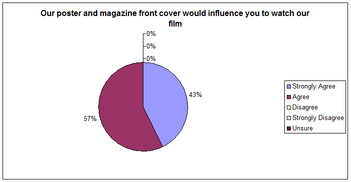

In general, we were realley pleased with our feedback, 95% of the audience agreed that our trailer looked proffeional and the majority of teh auience would also watch the film based on teh effectiveness of our trailer and ancillery texts.
Saturday, 12 February 2011
Analysis of My Film Magazine Cover
I'm beginning to get the hang of 'Prezi' :D Have a look at my funky yet informative analysis. Im very proud of it :)
Thursday, 10 February 2011
Film Premiere Presentation
In order to recieve audience feedack we held a creenign of our magazine front cover, poster and teaser trailer to students at our college and teachers. We spent two minutes introducing our task and reults. Here is the PowerPoint presentation I created in order to convey teh main ideas and plot behind REDMEPTION.


Firstly. we introduced the name of the teaser trailer and the editors.

Description of how we created our film poster, our props and the inspiration.

Research in to ways that we would market our film.


REDEMPTION is a British horror film and by advertising on buses, train stations and bus stops, we would target a British audience and 18+ adults who commute to and from work/school every day.

Our inspirations for our Film magazine cover.

The actor hiring process and selection. The selection of images for the magazine front cover.

The plot summary explained top the audience at the premier, before they view the trailer.

A brief evaluation of all the decisions, we made that resulted in the design and creation of our 3 pieces.
Sunday, 6 February 2011
Film Magazine colour palette

For the colour theme of our Magazine Cover, we wanted to make sure that white was implimented in order to resemble elements of our ancillary texts. For example white symbolises purity and is sterile. The dark shading gives the image depth and duplication of our film name makes the font more 3D, thus making the colours stand out against they grey scale. This is seen in our film poster. Therefore, we chose to make the magazine cover a white background with black shading. We chose to keep the font of our film name the same throughout all three texts and only changed the colours on the magazine cover is to match our scheme.
Gold gave the magazine a classic feel, it almost looks like a special edition cover, especialy as the image is in black and white.
Saturday, 5 February 2011
Our Film Poster


The decision to use the image of our image of the lead actor screaming/yelling: We have focused on the mouths of both our film poster and magazine cover thus both central characters are revealed to have open mouths, which captures the action of a situation.
I particularly favoured this image because it was a modern twist/translation of the image of an innocent looking Norman Bates (Hitchcock’s Psycho). Instead our villain is more aggressive and openly destructive. Norman Bates is an infamous character in horror; he puts on a false pretence, whereas we subverted the idea by stating that our character is: ‘THE NEW NORMAN BATES OF HORROR’.

Our banner states that the magazine is a special edition: '100 GREATEST HORROR FILMS OF ALL TIME'; I find that images in grey scale tend to be more captivating as they take away from the noise and complexity of colour images, by stripping an image of its colour the finer details of an image can be appreciated. Heath Ledger and Marlon Brando were both established actors, whereas the main actor in REDEMPTION is not well known. Thus the need for plugs, puffs, cover articles and pull quotes, which aid us to support and sell our film through the magazine.

Subscribe to:
Posts (Atom)